Context
Interaction Design Studio | Carnegie Mellon
Interaction Design Studio | Carnegie Mellon
Tools
After Effects | Illustrator | InDesign | Figma
After Effects | Illustrator | InDesign | Figma
Roles
UX Designer | UI Designer | UX Researcher
UX Designer | UI Designer | UX Researcher
Timeframe
6 weeks
6 weeks
—
The Problem
In cities across America, public transit is a daily ritual— an essential service that breathes life into the local economy by getting people to their places of employment, recreation, and healthcare. Unfortunately, for many commuters, transit is an uncomfortable experience riddled with moments of stress, boredom and confusion.
How might we reduce the anxiety and frustration associated with taking public transit and create better commuting experiences?
01
User Research Round 1
We began our research by first conducting a field review of other design solutions within the transit space. We hoped to learn about innovations that might impact our approach to design solutions.
We scoped our research questions to best understand the experiences users have on transit every day, their feelings about those experiences, and their general interest in learning about or connecting with others as part of their journey. We heard from an audience of users, primarily in the 20-35 age bracket, who used different types of transit as part of their daily or weekly routines.
We wanted to learn how, when, why, and what types of public transit people use, so that we might develop opportunities to share information, connect users with one another and their surroundings, and introduce moments of delight to improve the transit experience.
Survey
We conducted a survey of forty nine people across three major metropolitan areas in order to understand the average experience people have while using public transit and use data to gain a big picture view of the problem space.
What We Learned
Most transit users try to minimize wait time.
---> How might we make wait times more transparent?
While waiting, most people used phones.
---> Consider designs that employ mobile.
Time spent on transit ranges from 11 to 40+ minutes.
---> Consider idle time as an intervention point.
---> How might we make wait times more transparent?
While waiting, most people used phones.
---> Consider designs that employ mobile.
Time spent on transit ranges from 11 to 40+ minutes.
---> Consider idle time as an intervention point.
Empathy Map Interviews
We conducted a total of nine interviews with individuals in order to understand the nuances and details of how people personally experience public transit and gain insight and inspiration for possible solution ideas.
What We Learned
There is tension between social time and me time.
---> Can we create and "opt-in" experience for people
People experience anxiety while waiting.
---> How might we mitigate this emotional experience?
People try to reduce wait time.
---> Can we make tracking more accurate and reliable?
---> Can we create and "opt-in" experience for people
People experience anxiety while waiting.
---> How might we mitigate this emotional experience?
People try to reduce wait time.
---> Can we make tracking more accurate and reliable?
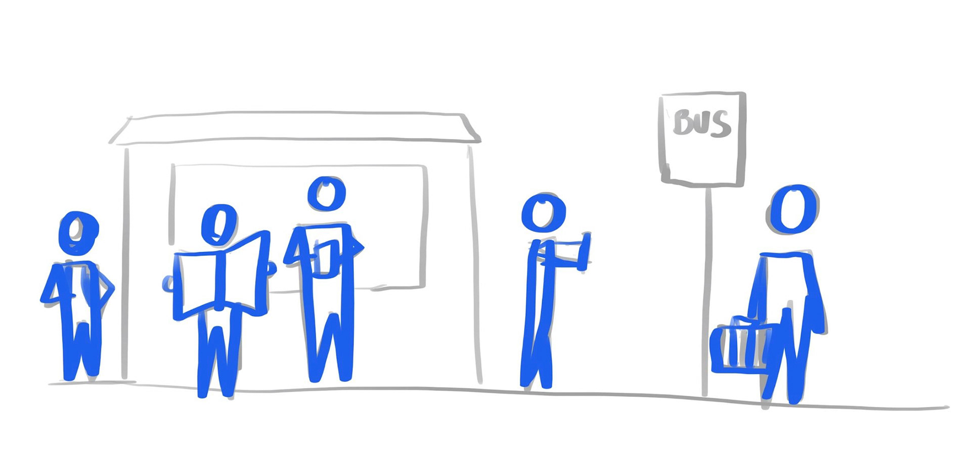
AEIOU Observations
We conducted a total of four observations of different bus stops in Pittsburgh to gain a better understanding of the physical space of transit and the interactions that occur within these spaces.
What We Learned
People are visibly impatient while waiting.
---> Can we relay information accurately and timely?
People respect personal space.
---> How can we preserve that value?
Passengers reflect their neighborhoods.
---> How might we be inclusive in our design?
---> Can we relay information accurately and timely?
People respect personal space.
---> How can we preserve that value?
Passengers reflect their neighborhoods.
---> How might we be inclusive in our design?
02
Ideate
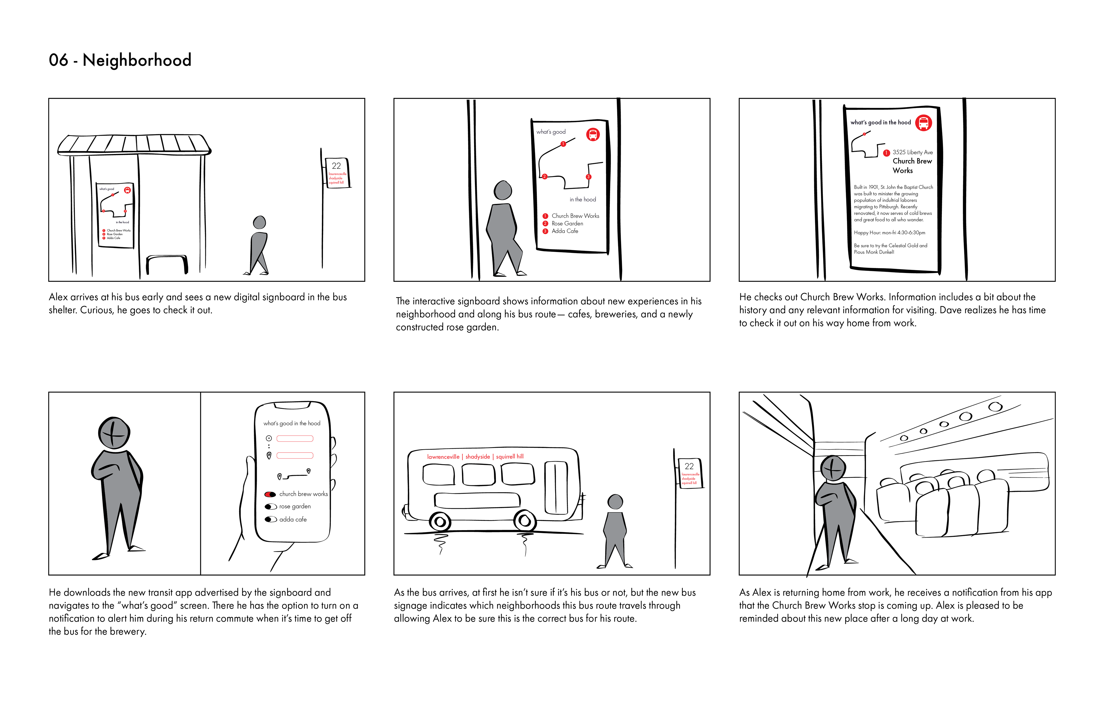
Our first round of concepts focused on providing users with opportunities to address the concerns we heard through our initial round of research. We heard that anxiety about transit was a problem and developed three different concepts to address that theme. At this stage, we focused on the bus as our main form of transit.
Initial Concept Ideas
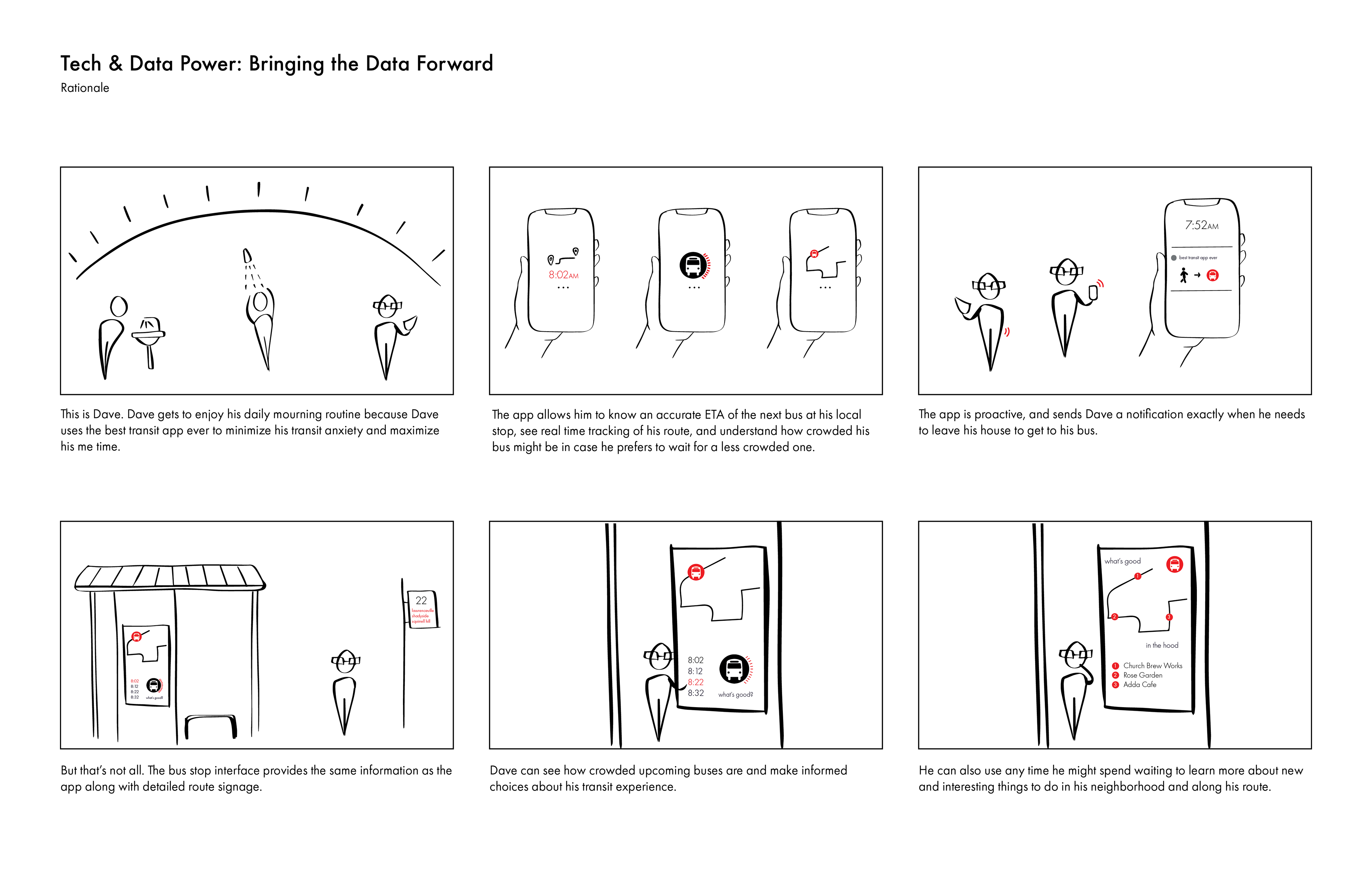
1. Bringing Data Forward: This concept involved an app that showed reliable transit tracking data that was trustworthy and clear.
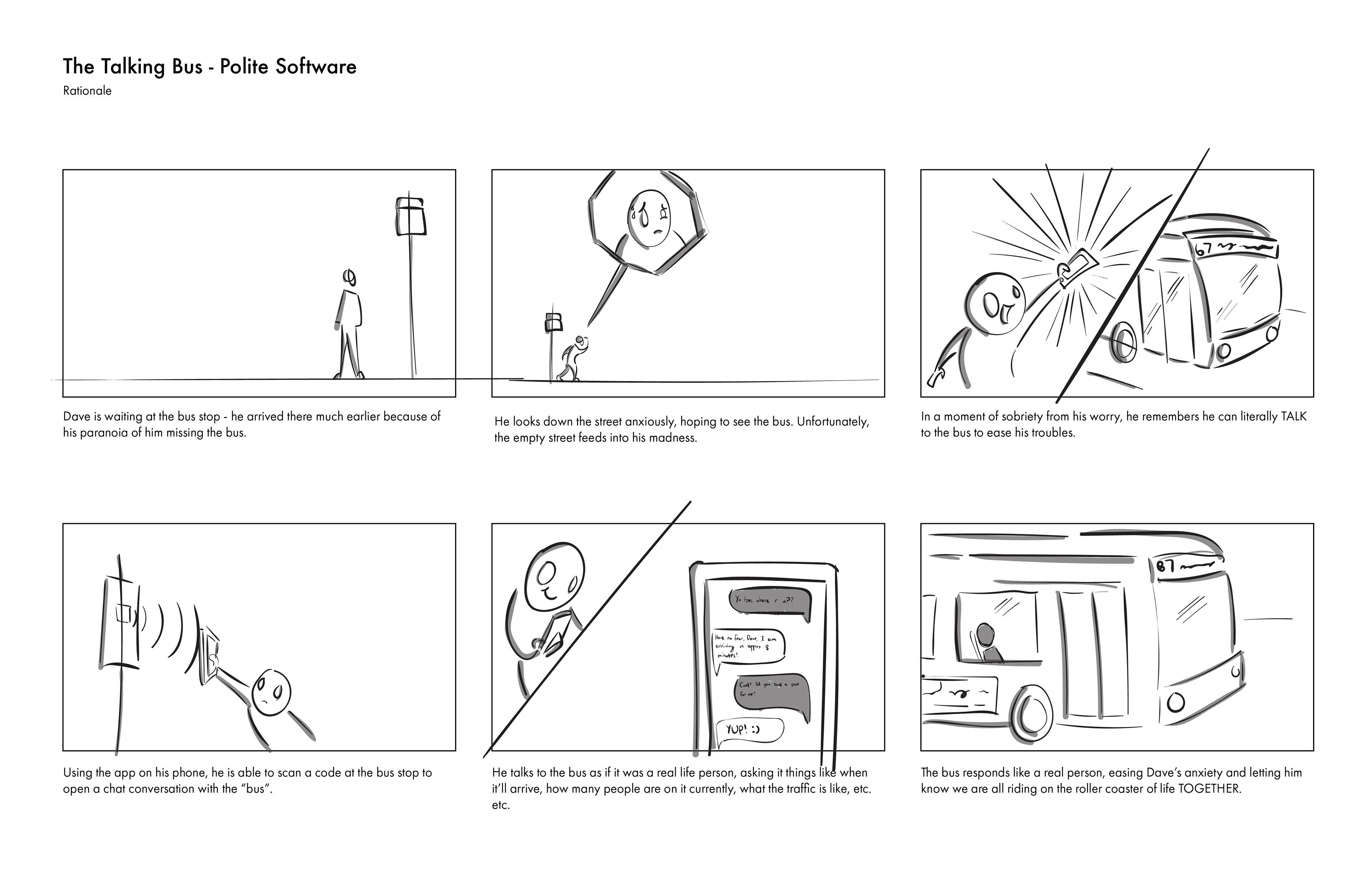
2. The Talking Bus: This concept used AI to allow the user to test the bus to ask questions about arrival times and available seats, putting them in control of the interaction.
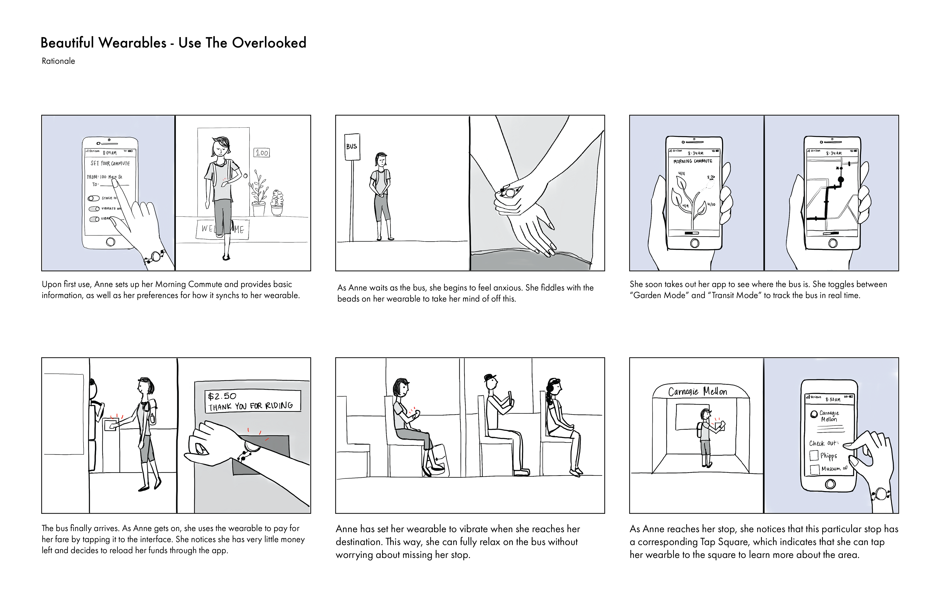
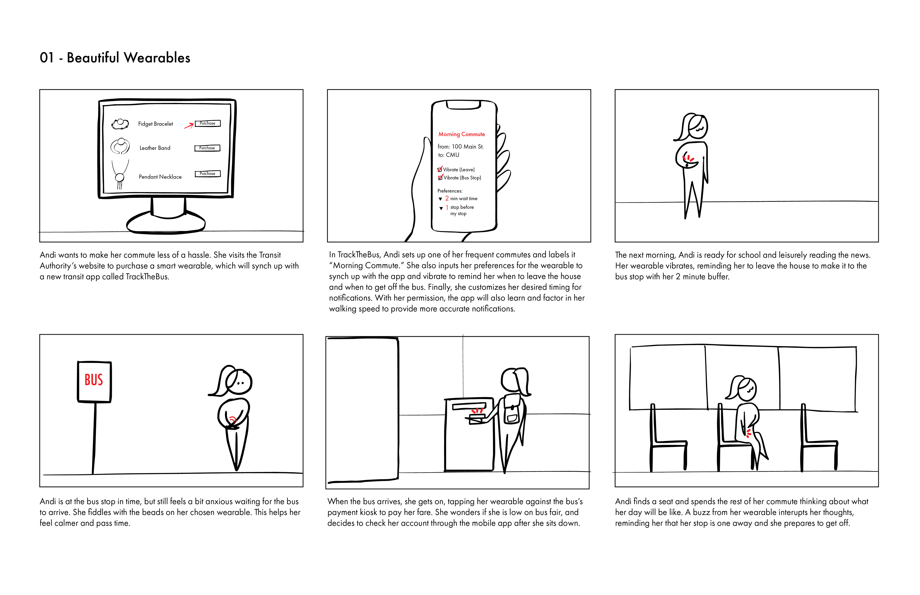
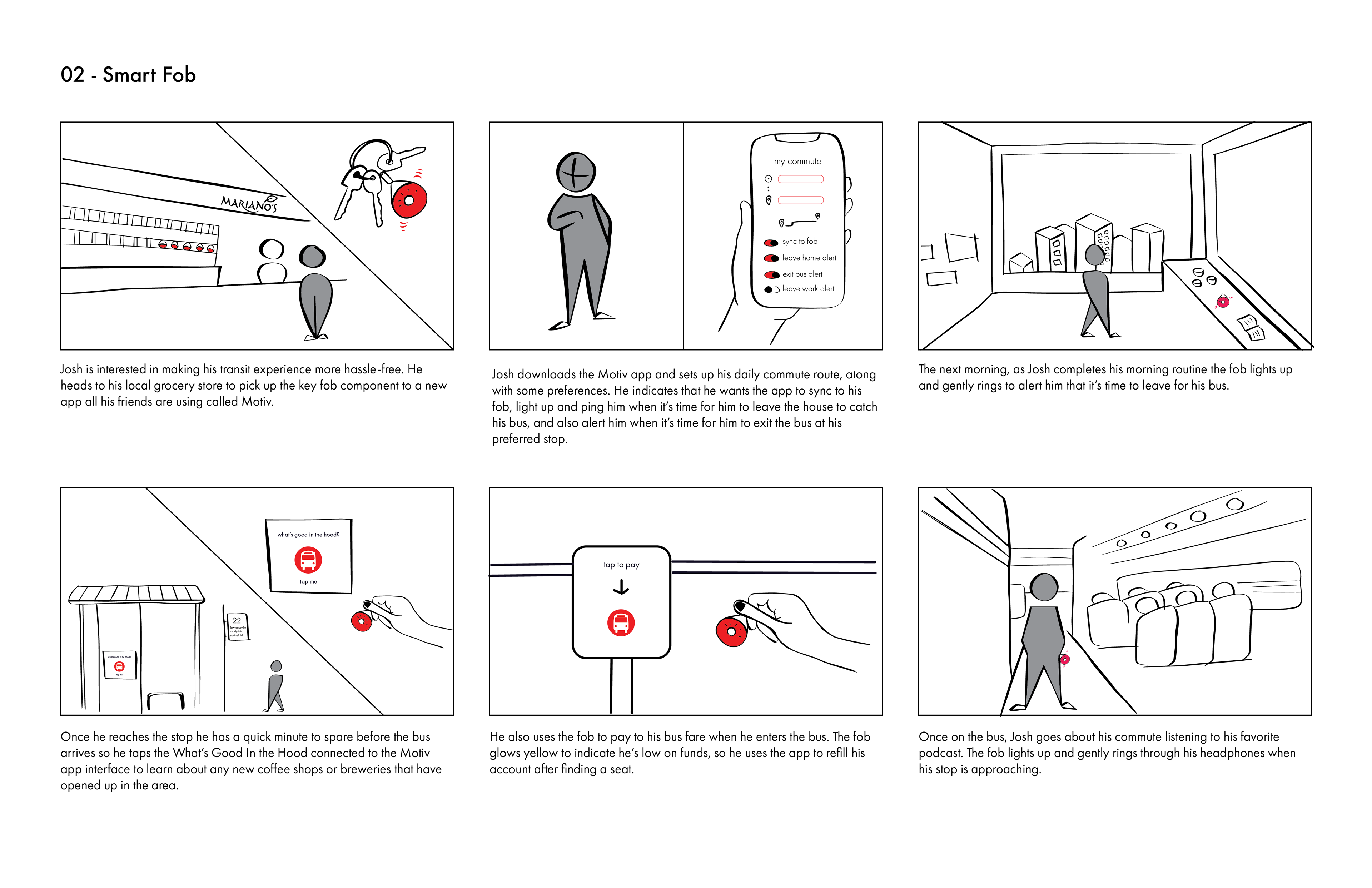
3. Beautiful Wearables: This concept involved a bracelet or key chain that allowed users to have a phone-free experience by presetting their route and being signaled about timing before transit and approaching stops while on transit.
03
User Research Round 2
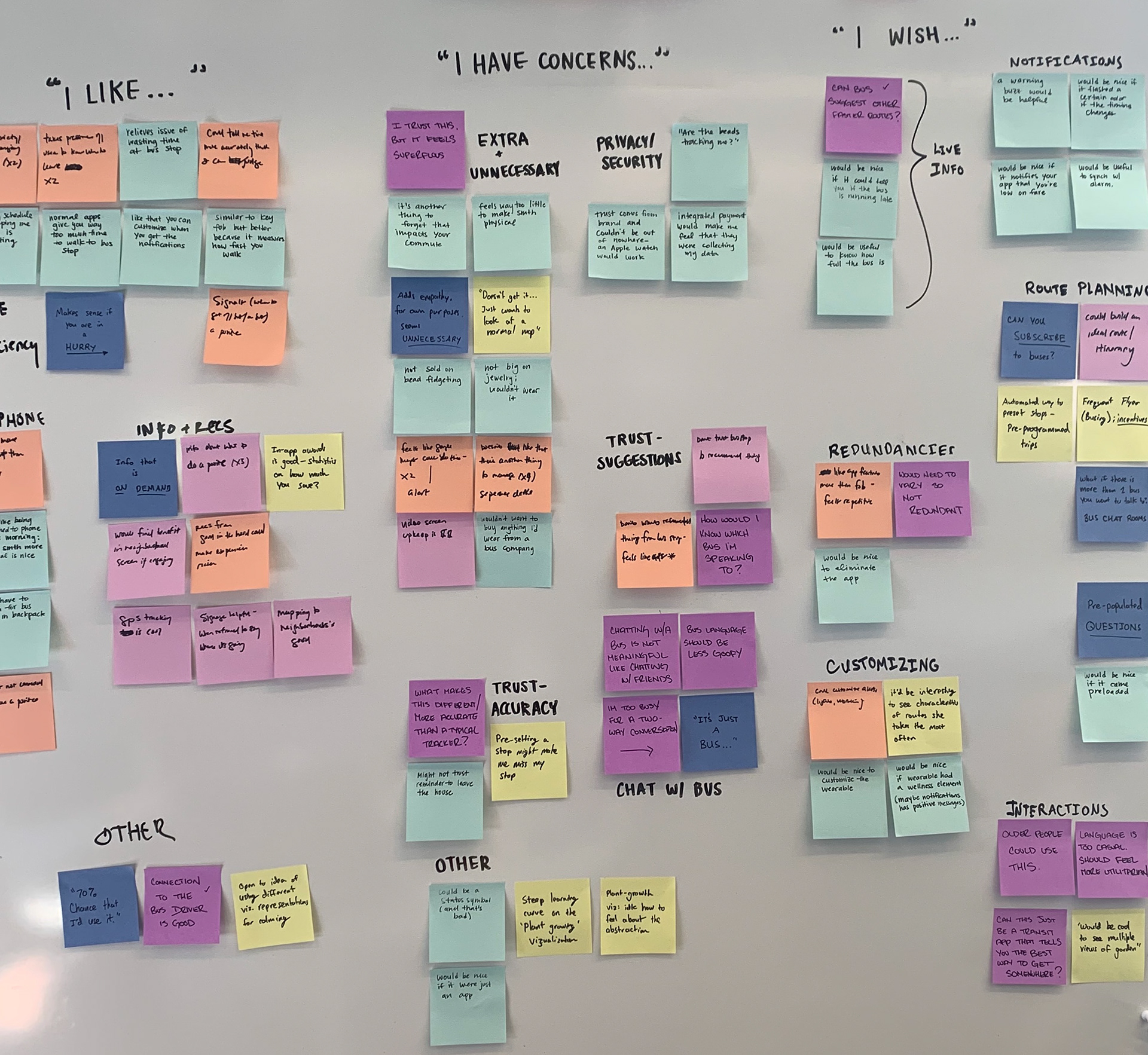
We shared our three concepts for user feedback and found that what people were interested in as a solution varied widely.
Based on the feedback we received, we put together a series of six storyboards that focused on specific features that people had mixed feelings about. We used speed dating to test these concepts and get more specific about the aspects of the designs that were valued.
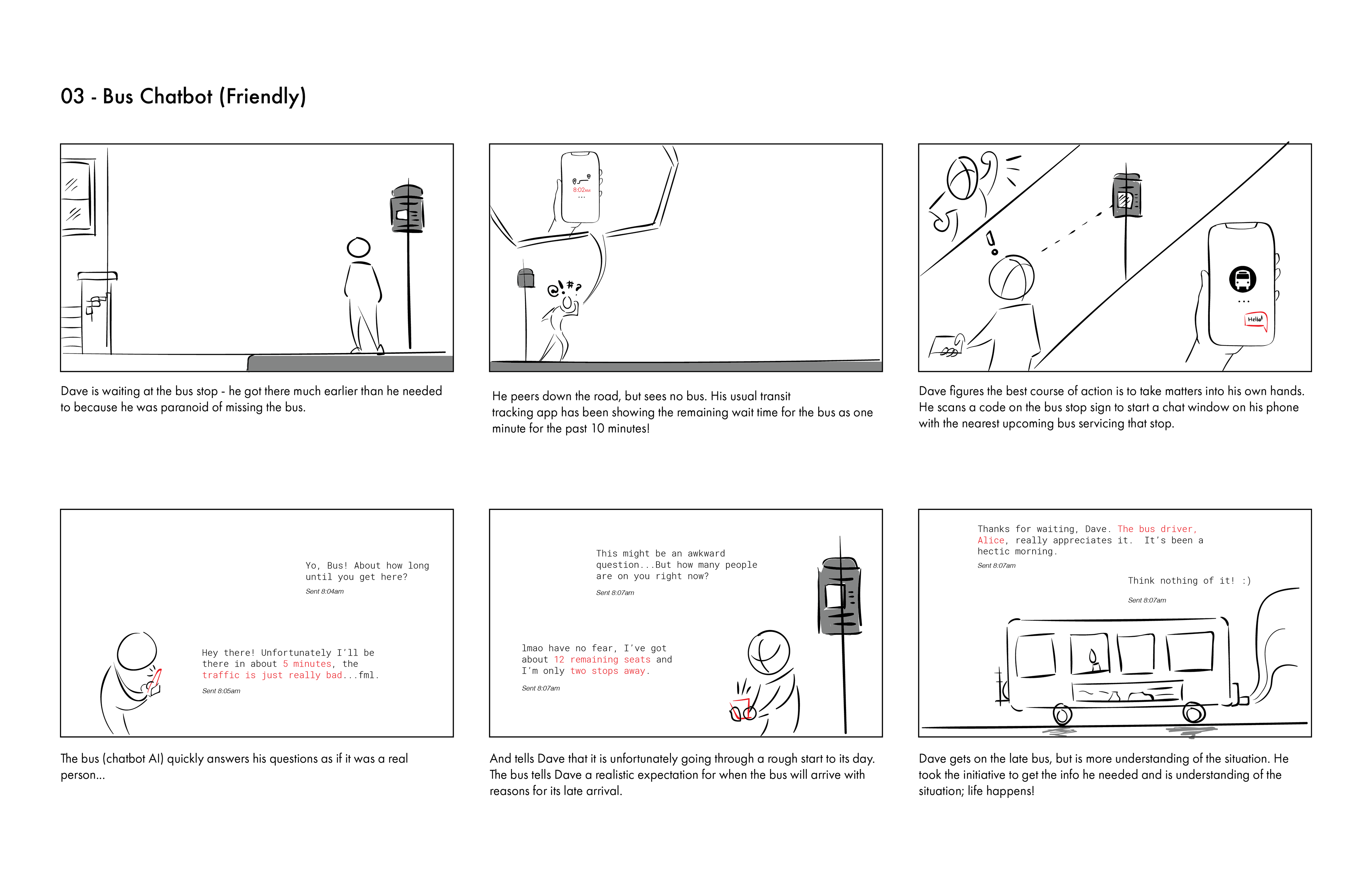
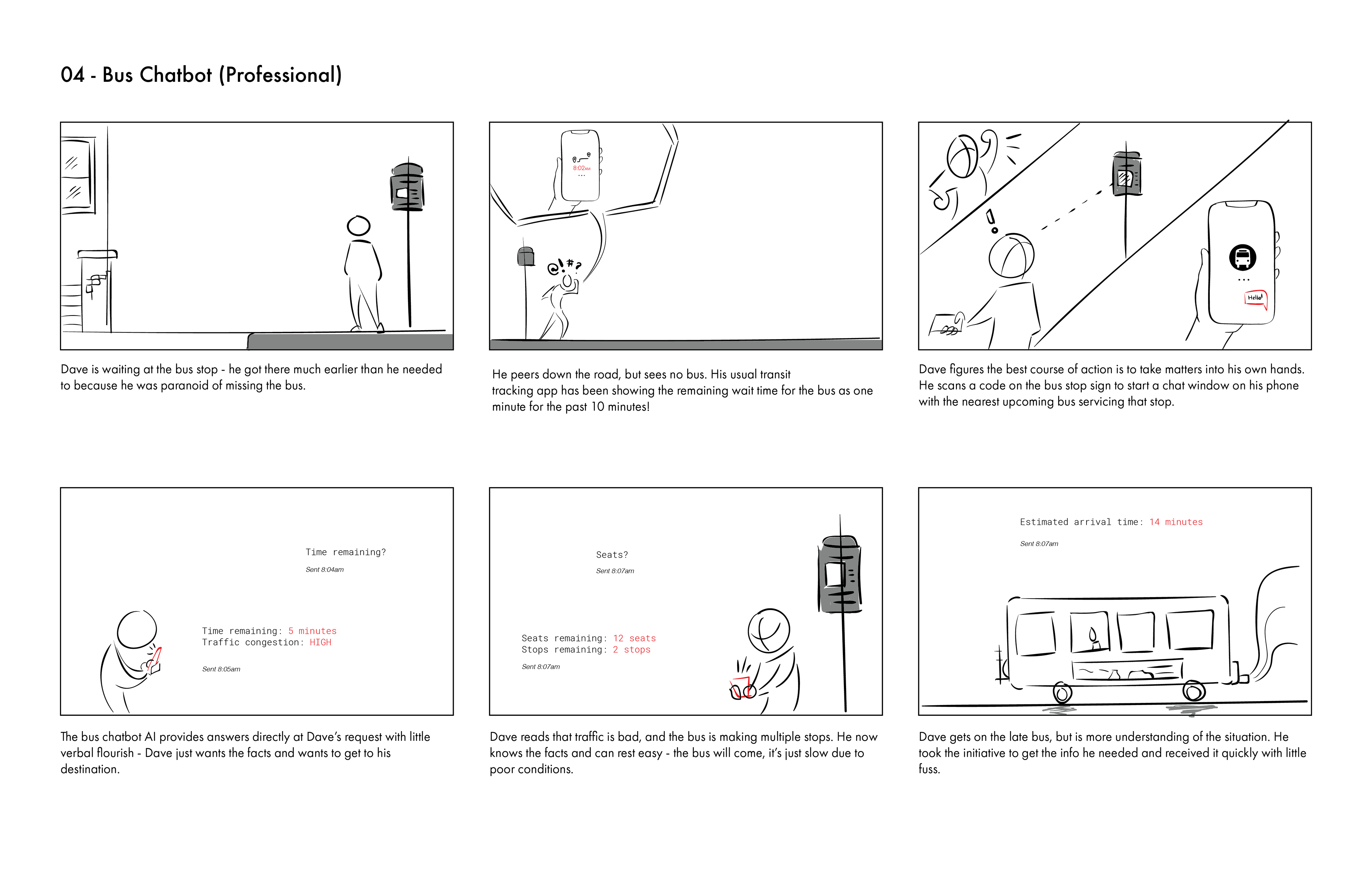
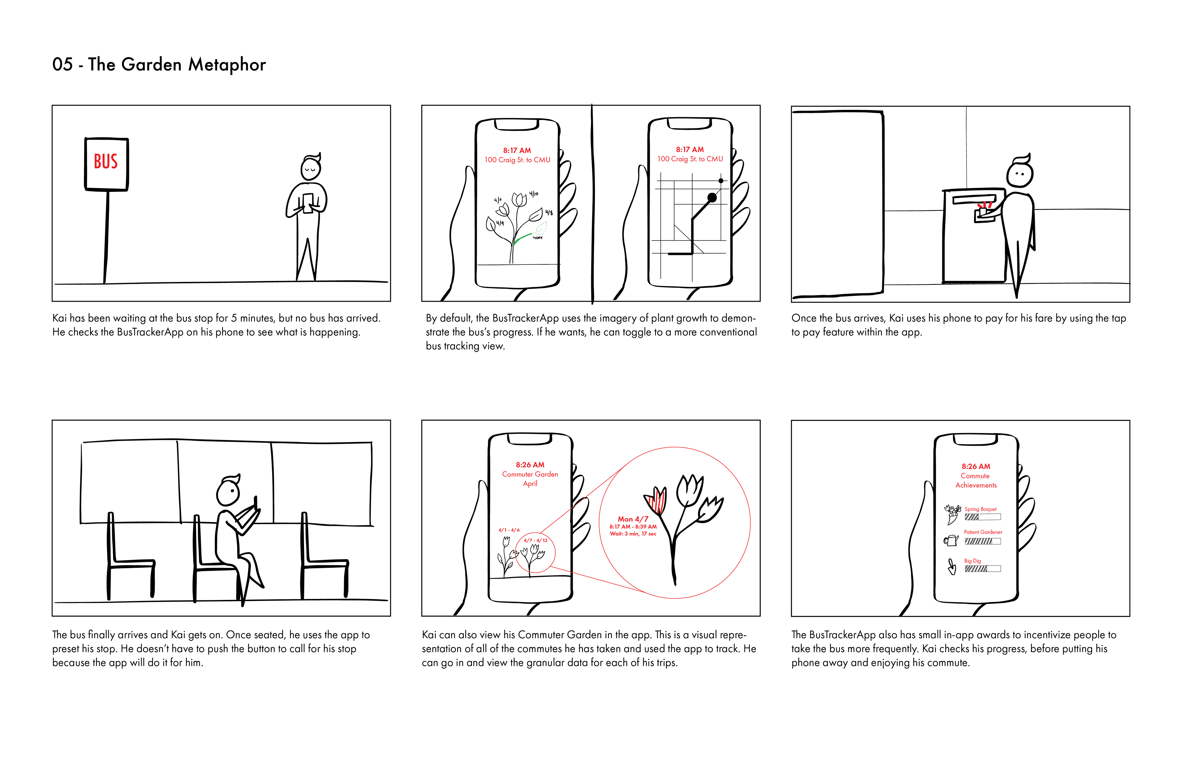
We randomized the order of the storyboards to eliminate the role that order might play in people's thoughts and opinions. We showed each storyboard to our participants for 5 minutes each and asked for general feedback. Once we were finished, we used affinity diagramming to sort the main points into three categories.
04
Iterate
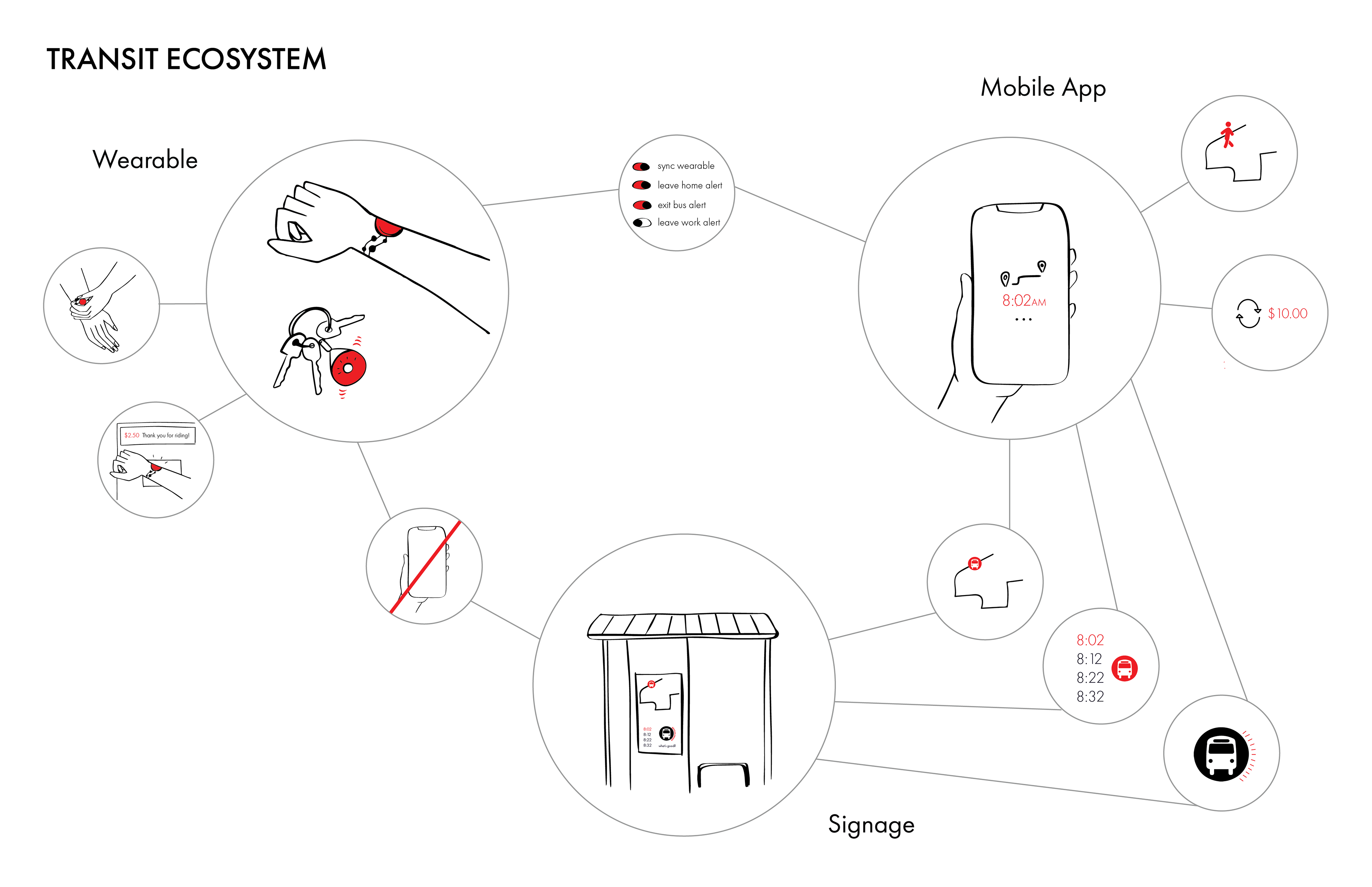
Our first round of concepts focused on providing users with opportunities to address the concerns we heard through our initial round of research. We heard that anxiety about waiting for transit was a problem and developed a product system to address that theme focusing on the bus as our main form of transit.
Concept 1 Components
1. Wearable: A bracelet or key chain that allowed users to have a phonefree experience by presetting their route and being signaled about timing before transit and approaching stops while on transit.
2. Mobile App: A mobile app that tracked transit real-time, and provided information about wait times, and included a tap-to-pay feature.
3. Signage: Digital bus signage that shared tracking information, mirroring the app.
Concept 2 Components
1. Map & New Resident Welcome Kit: Customized to welcome you to the transit options in your neighborhood
2. Transit App: Optimized and customized transit based on your preferences
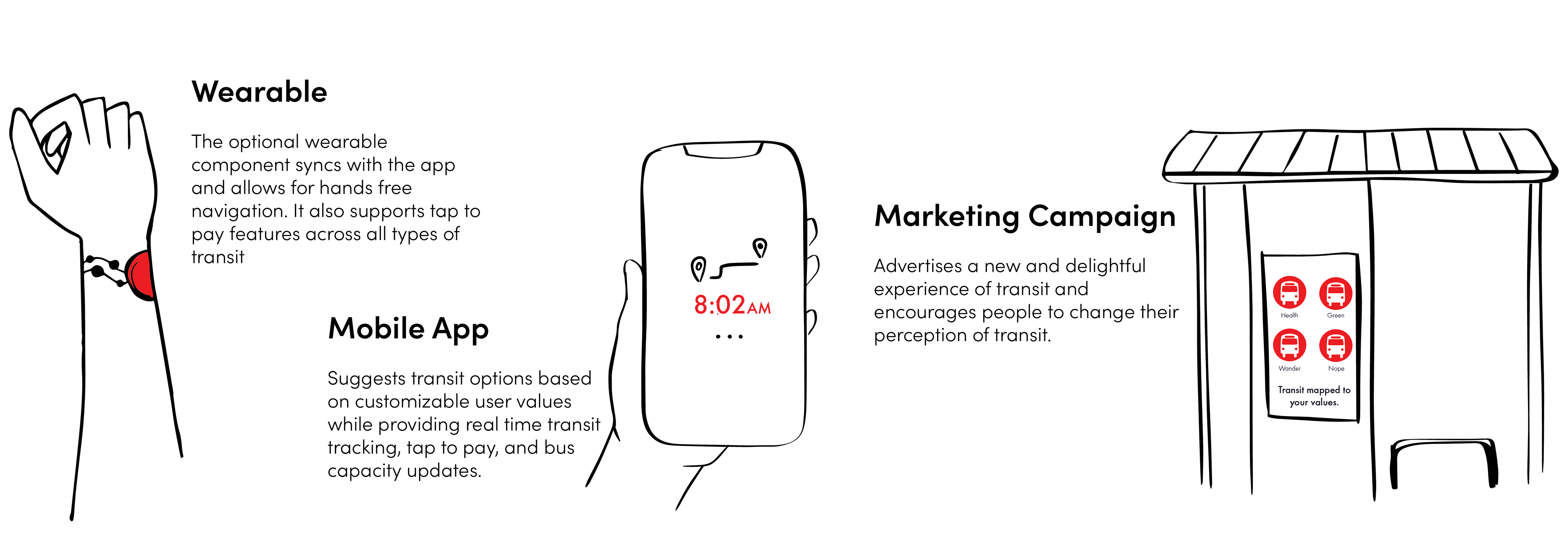
3. Optional Wearable: Syncs with the app to afford a phone free transit experience
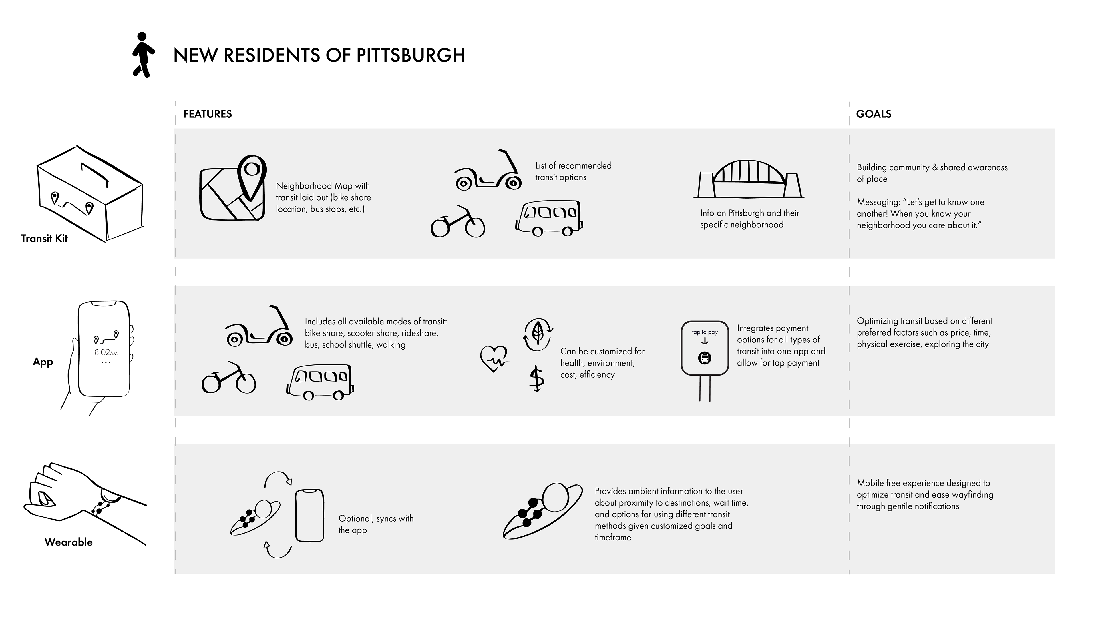
Final Concept Components
Feedback from the second round of user research led us to rethink our approach to the transit ecosystem. Users were receptive to the wearable and use of the mobile app, but the welcome kit and printed map felt unnecessary. Our final design incorporates the idea of optimized and customized transit into an ecosystem of three elements: An app, called Via, an optional wearable, and a targeted marketing campaign. These components work together to provide the user with the opportunity to set transit preferences and re-frames the transit experience as once that is tailored to meet their needs.
05
Prototype
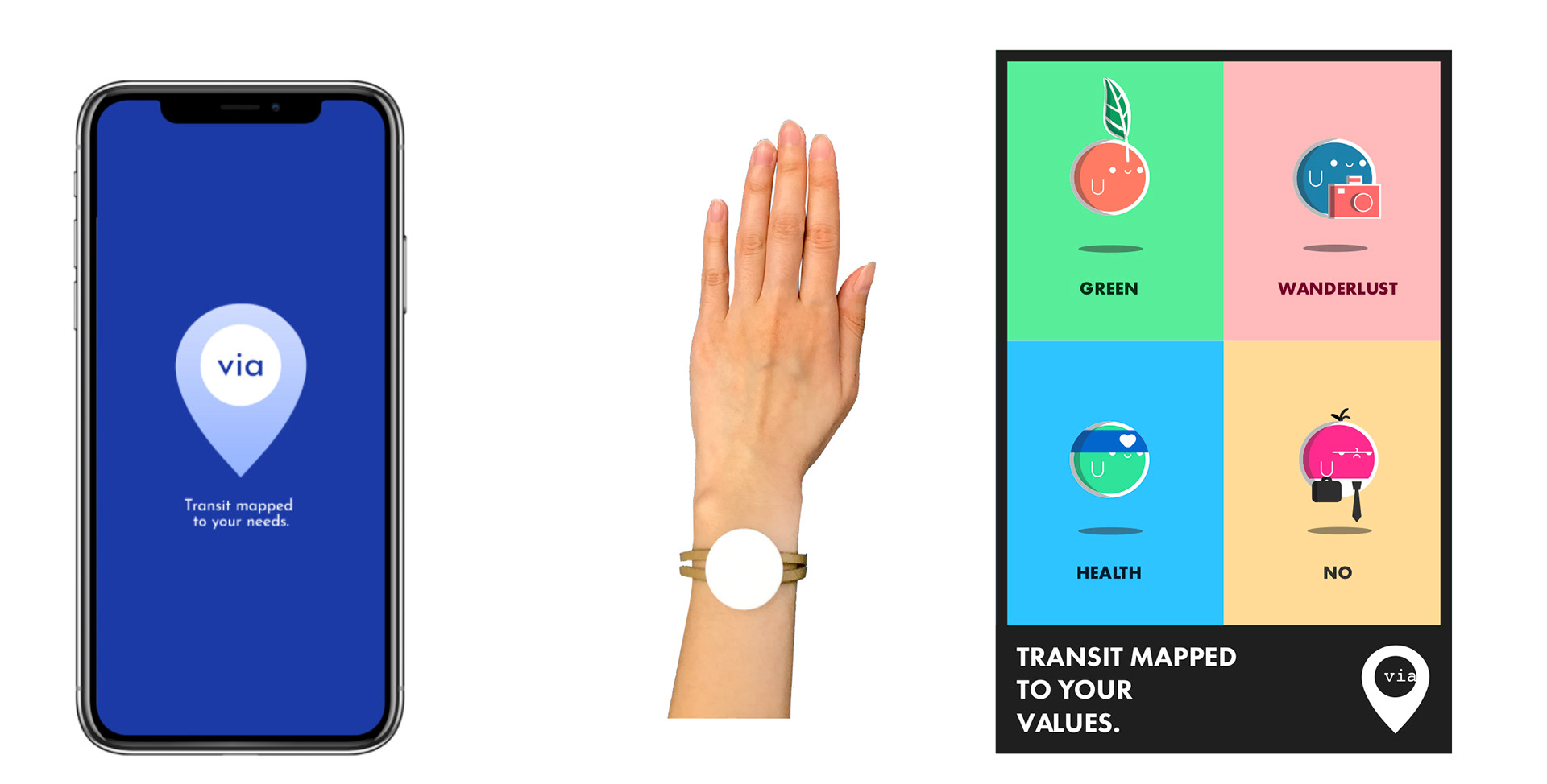
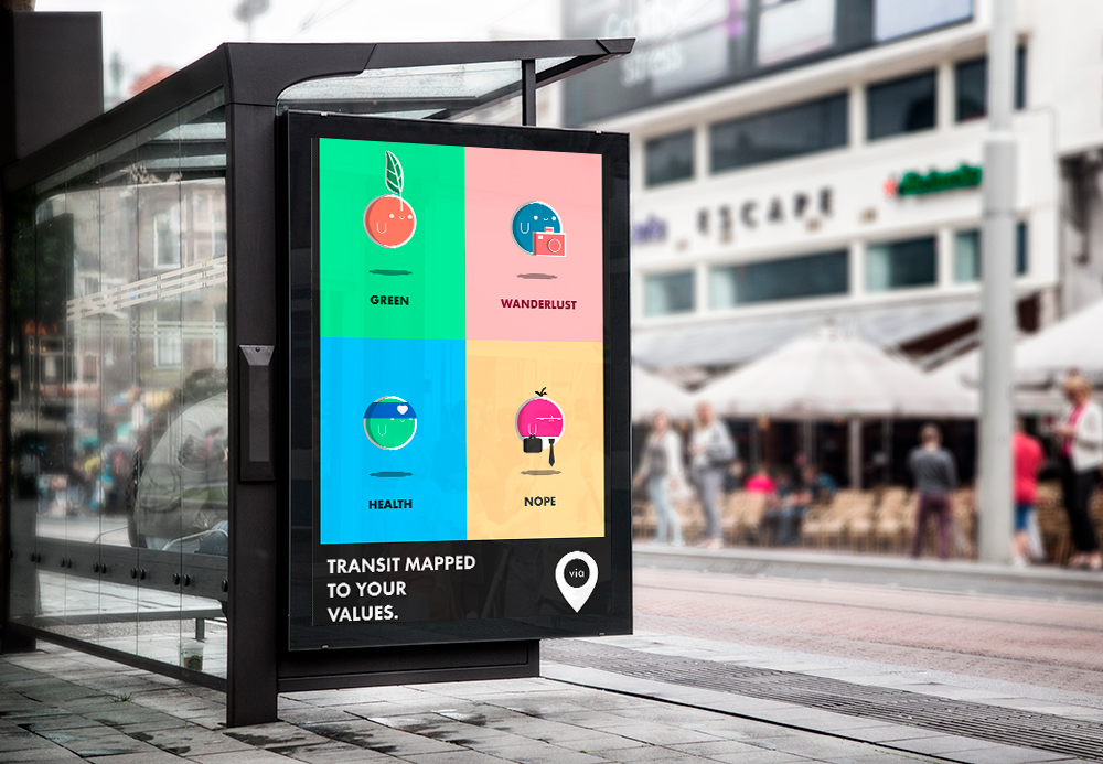
The App
The via App suggests transit options based on a user's values. Health mode will present options for biking, running, and walking, as well as the number of calories burned while doing these activities. Green mode presents eco-friendly options and lets users know their carbon footprint. Wanderlust mode provides suggestions of interesting nearby places.
via also has a Standard mode, which presents options that are most efficient. That said, no matter what mode users are in, via brings the relevant transit data forward in a way that is accurate and reliable.
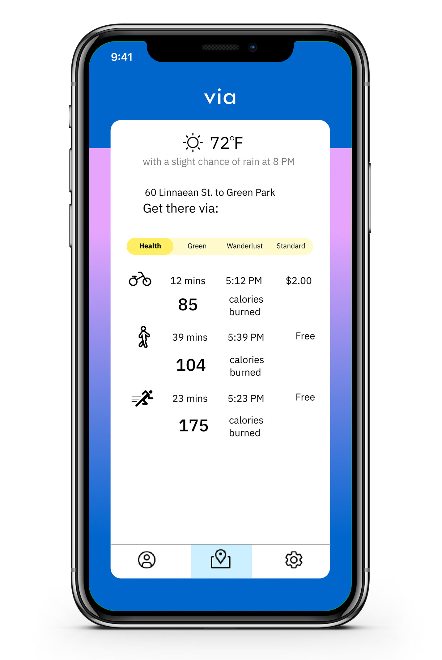
Health
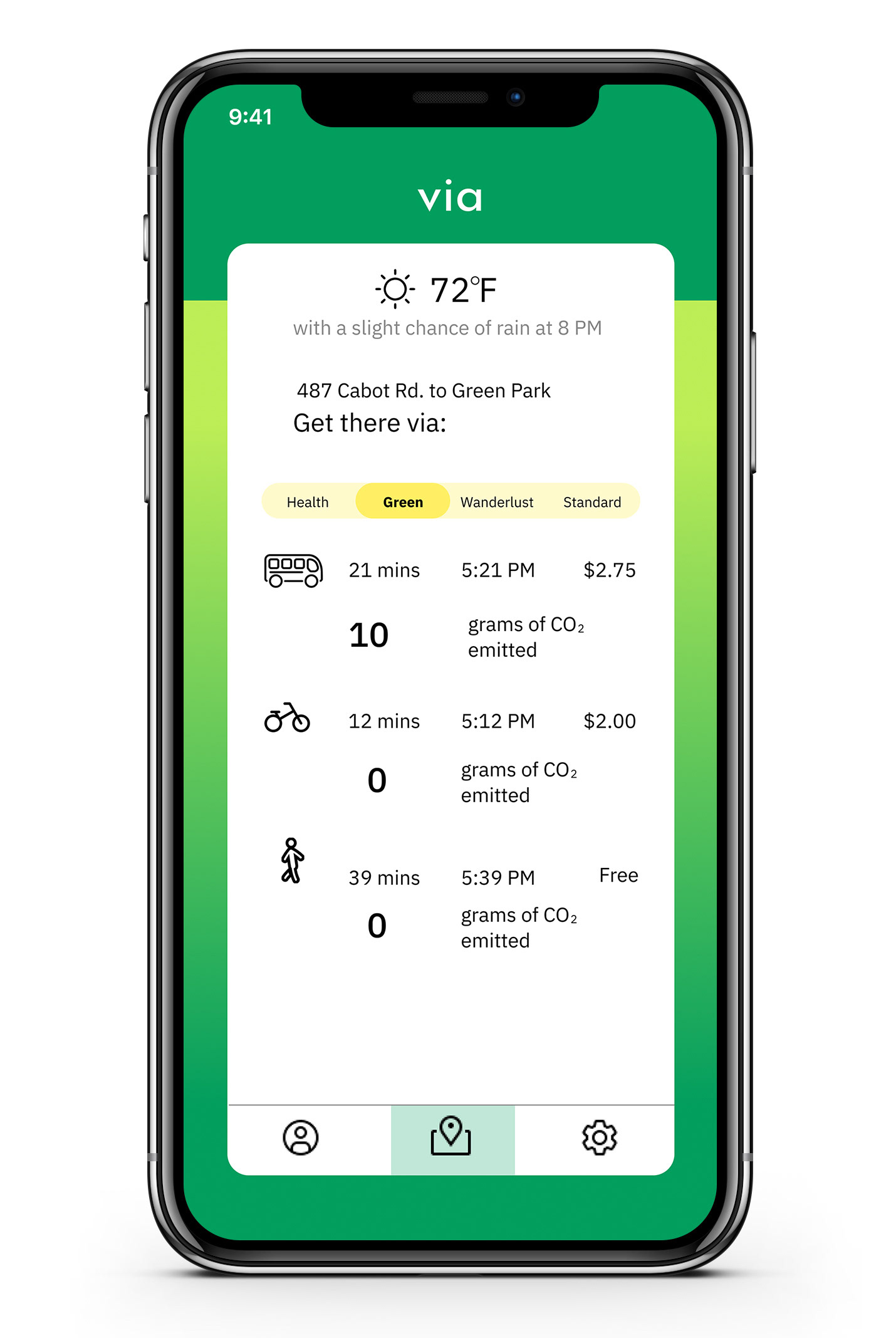
Green
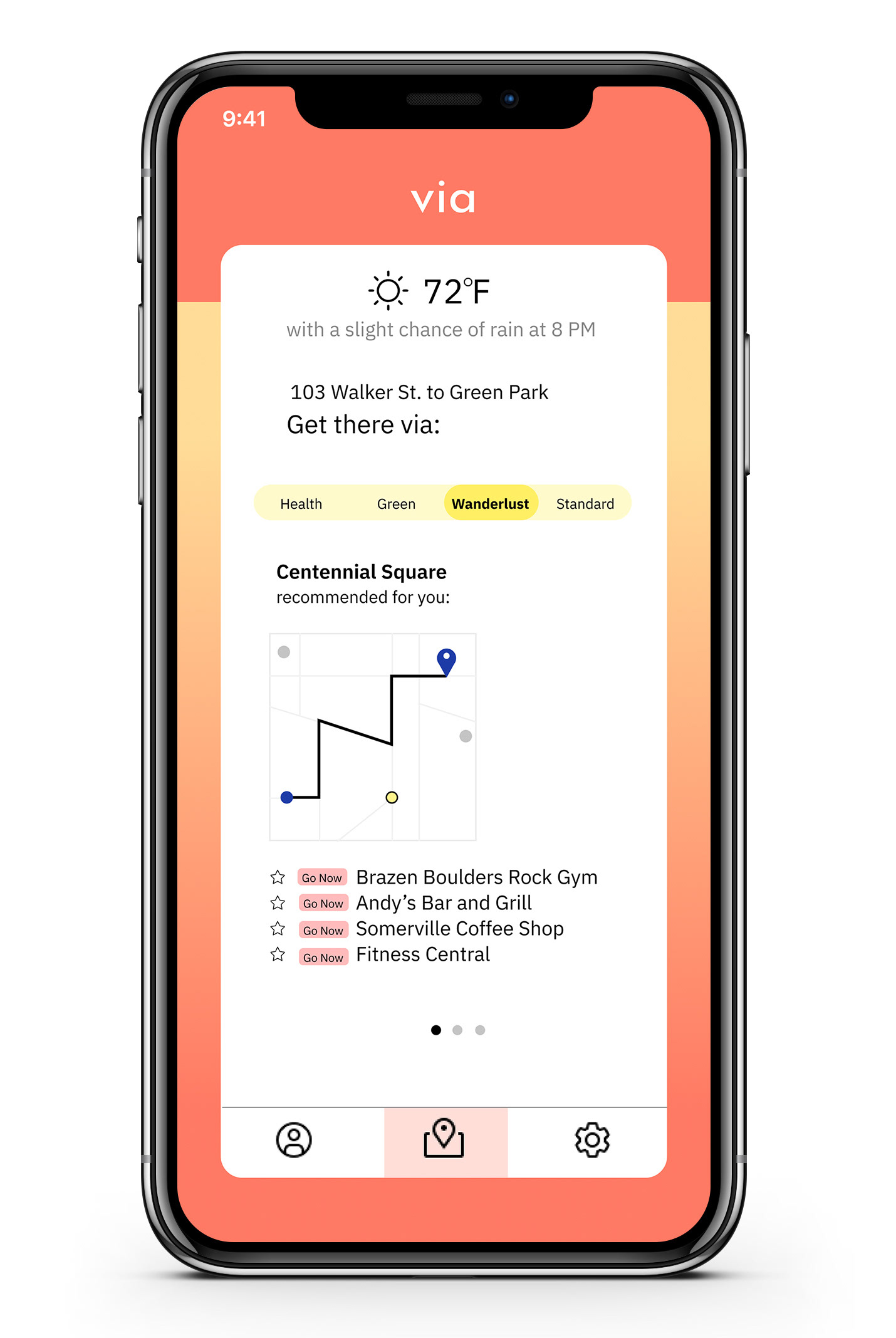
Wanderlust
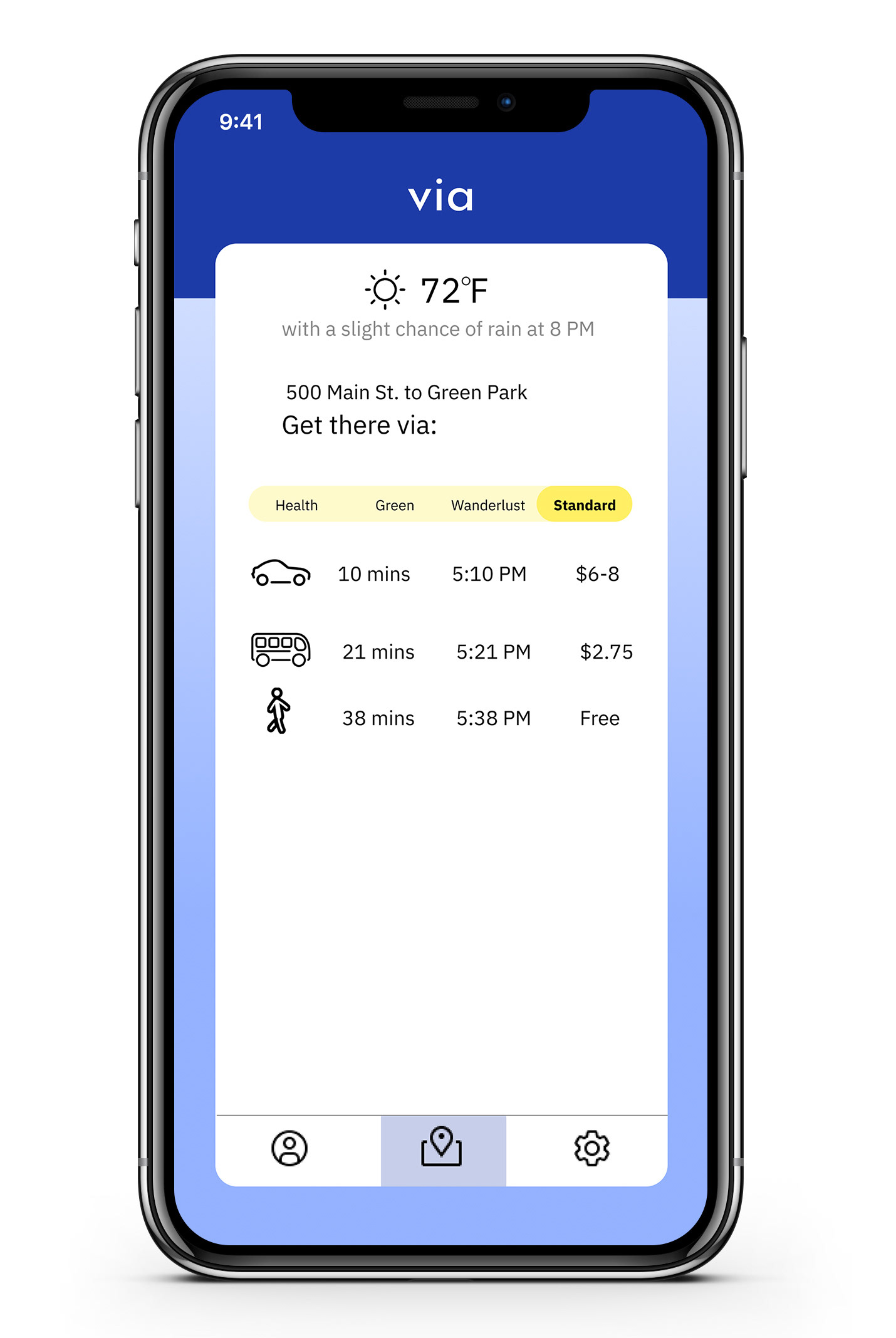
Standard
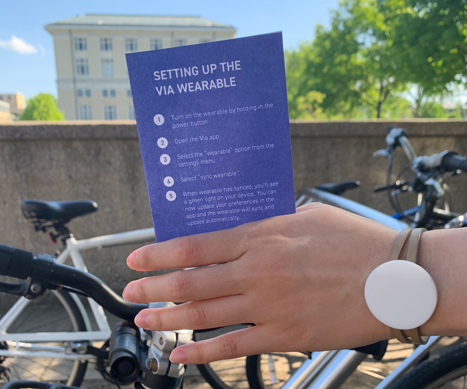
The Wearable
The wearable remained a part of the final ecosystem, but is optional. We envisioned this as a phone-free feature for a specific type of user - one who was comfortable and familiar with the idea of a wearable, who would trust the device to support their navigation. The wearable includes features like tap-to-pay, notifications that align your preferences to time when you need to leave the house, and notifications that signal when you’re nearing your stop, station, or predetermined destination.
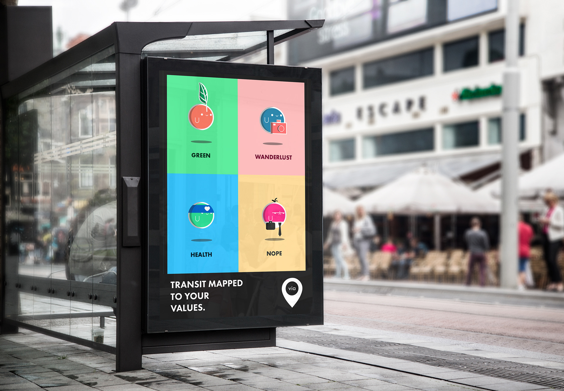
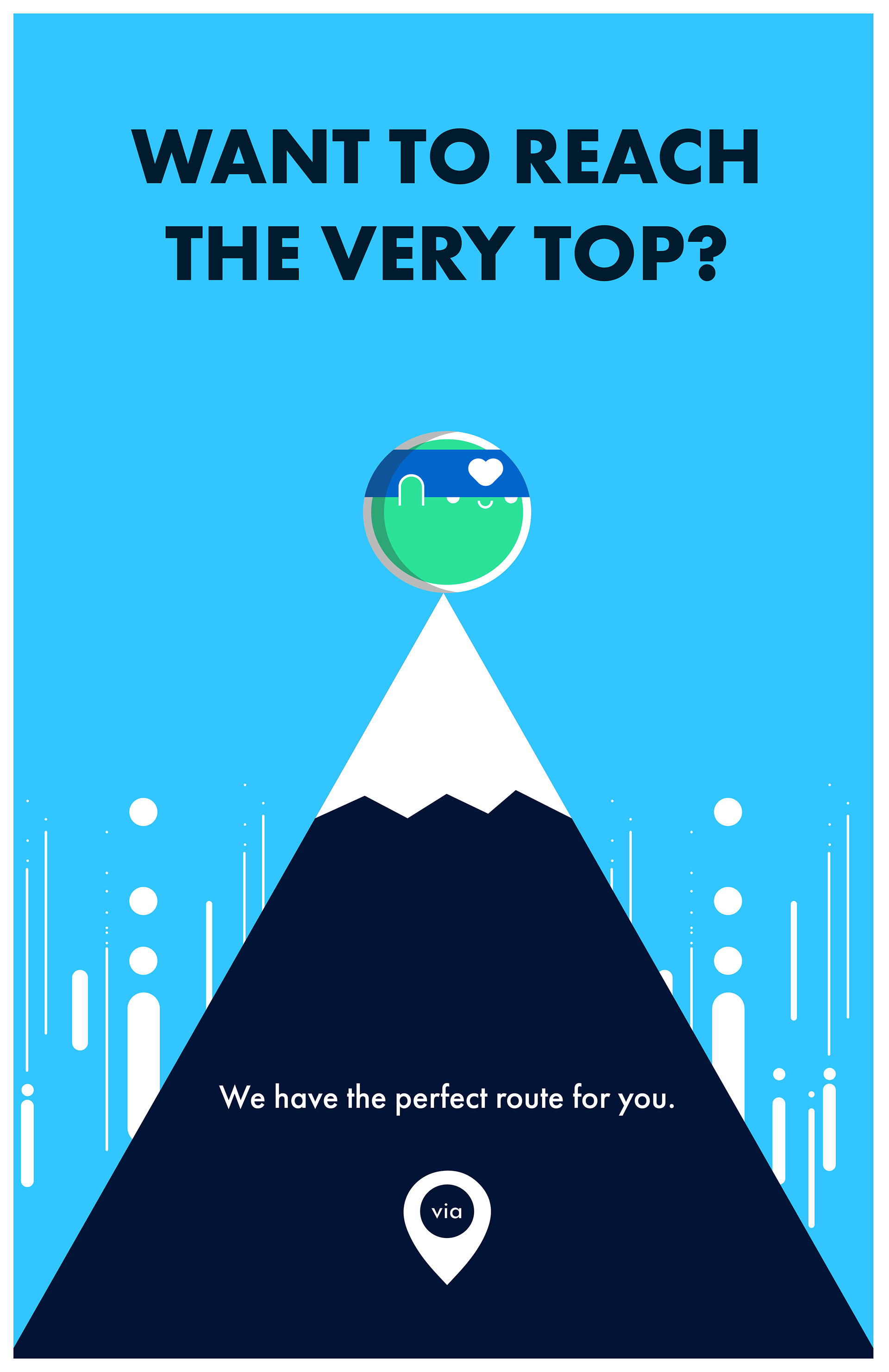
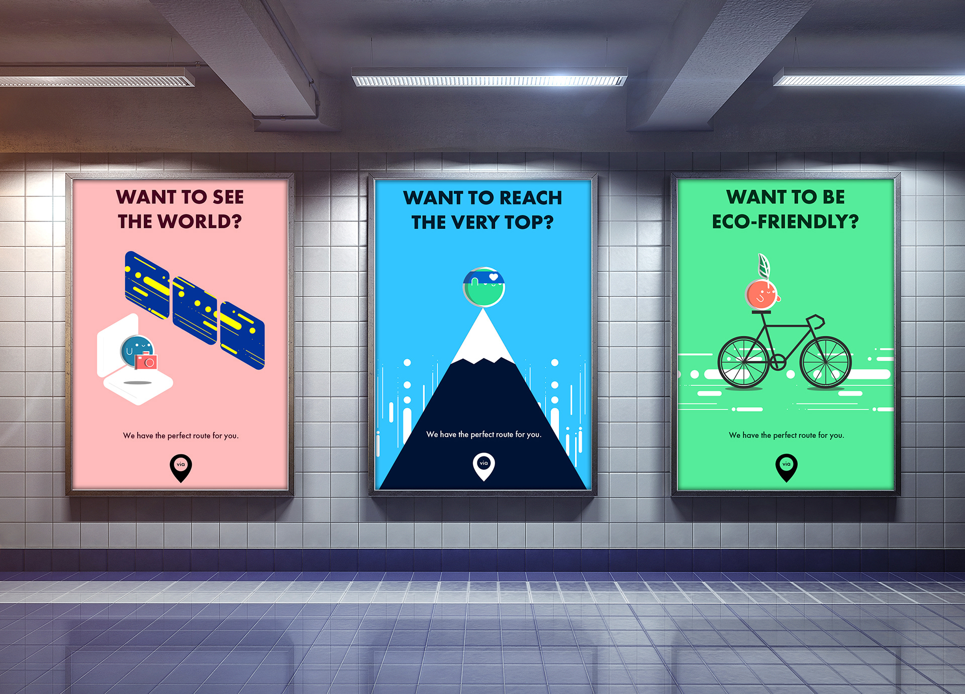
The Marketing Campaign
The marketing campaign is intended to delineate the different app preferences, accomplished by blocking them into characters with specific visual traits and color palettes. We chose to use characters to avoid pigeonholing users into a particular type of transit user. We wanted potential users to be free to toggle between characters as they saw fit. The language and tone of the campaign implies that you can be any one of the characters on a given day - it’s up to what you want to get out of your route as opposed to being locked in to one single identity. We felt it was important to help lighten the mood around transit through this campaign, not just promote the app. Our goal was to turn the perception of transit into something more delightful.
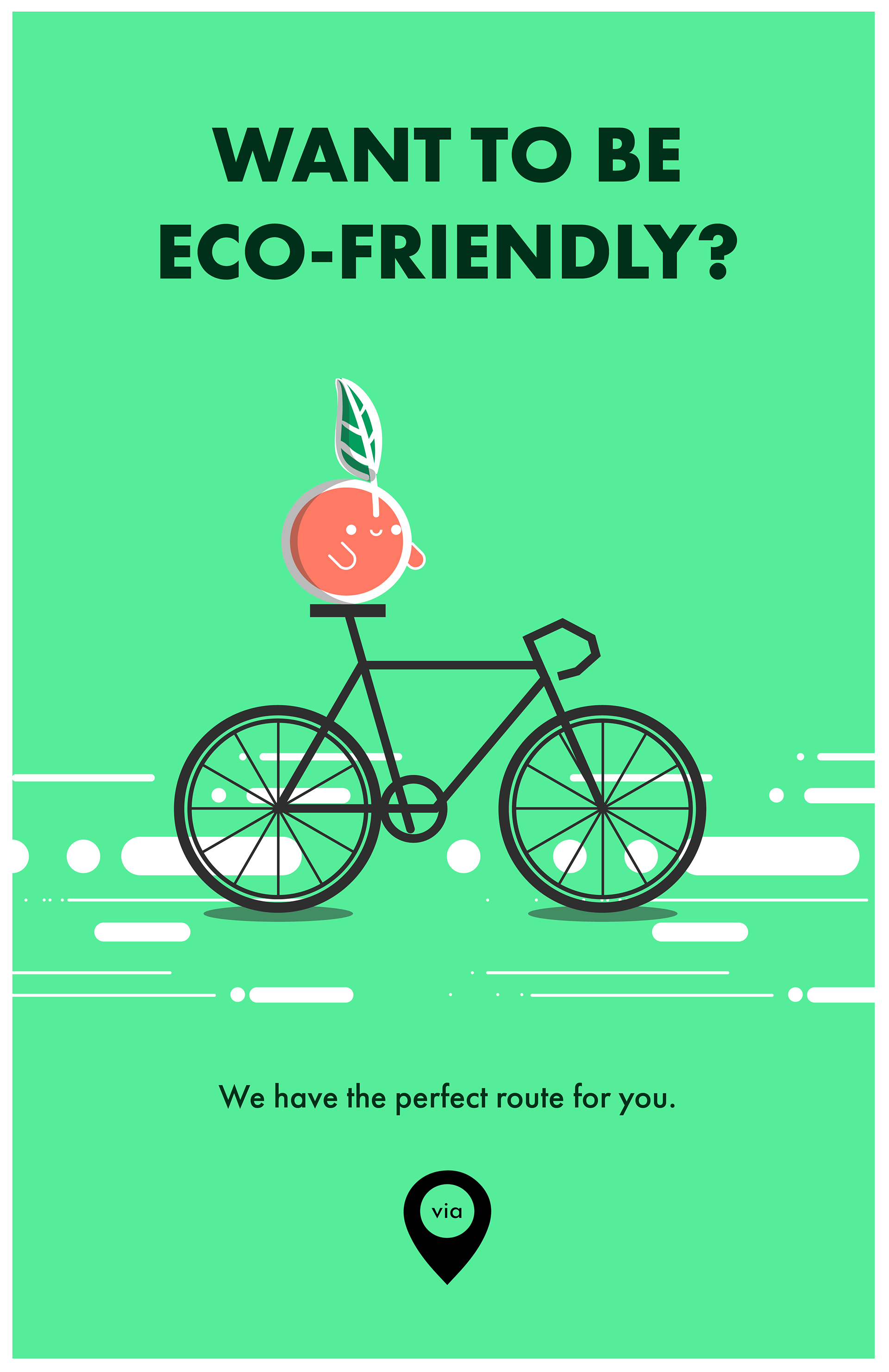
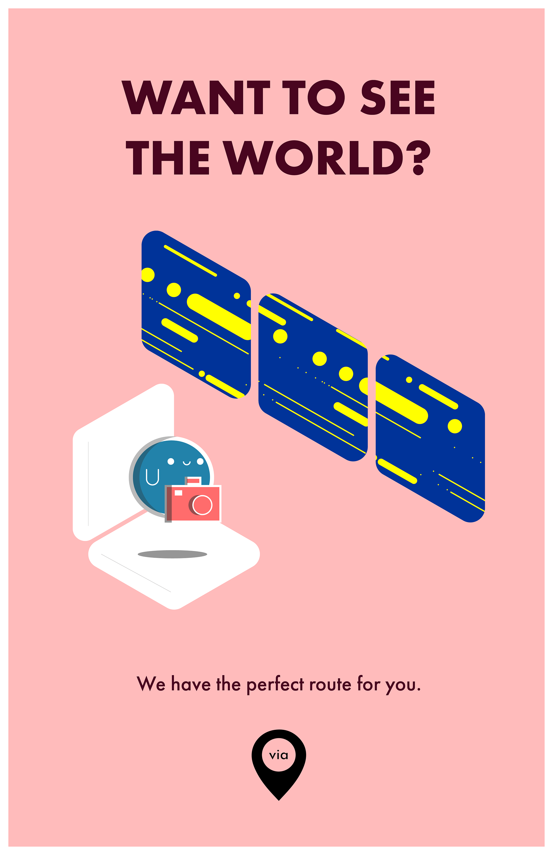
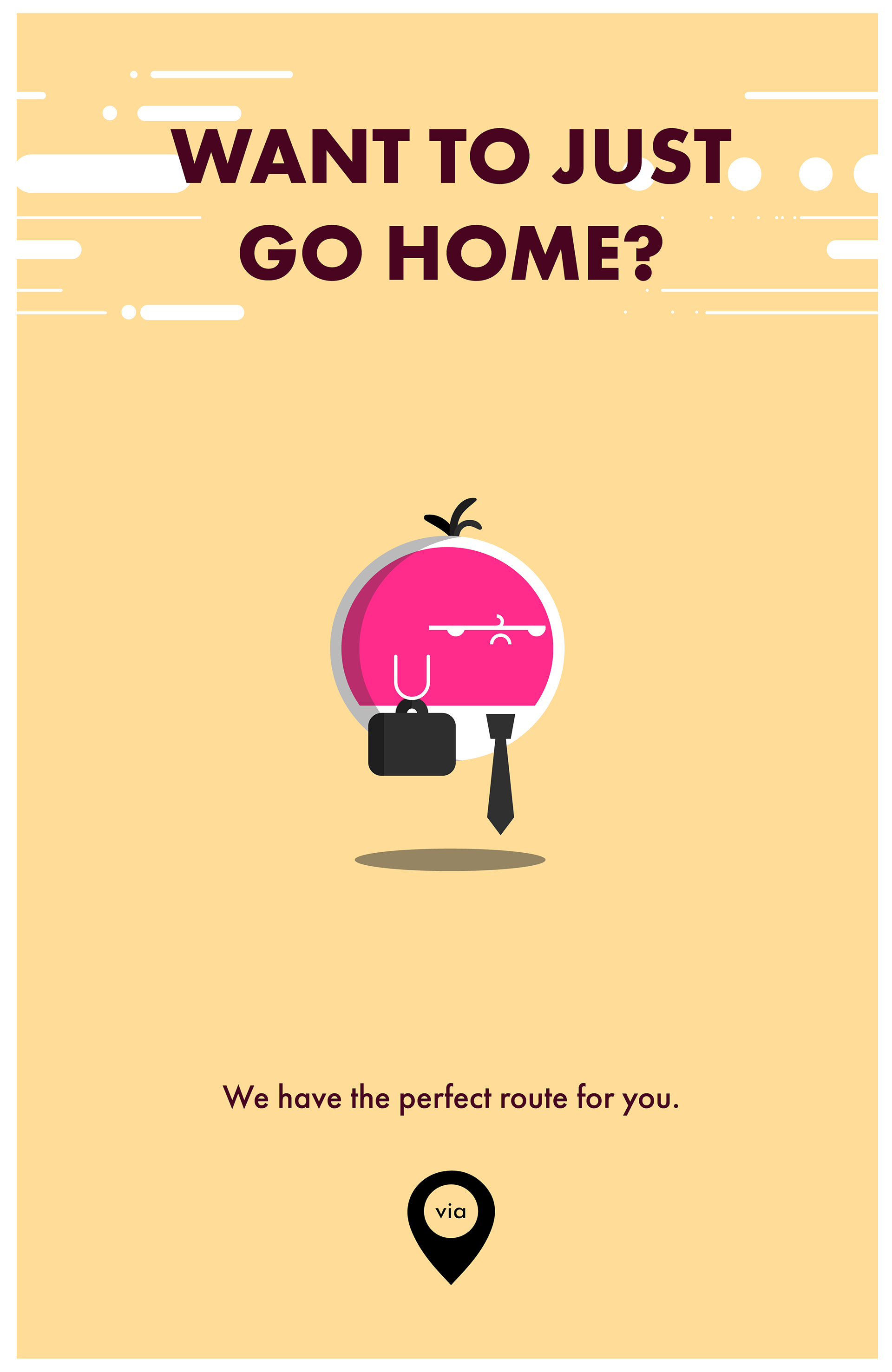
06
Reflections
With this project, we learned that sometimes the research points in many different directions, and that can present an opportunity. We unearthed so many different perspectives that the one thing that remained clear was to give people choices, and to re-frame the narrative. It was in returning to the research and rethinking some of the less obvious themes that emerged that we were able to arrive at a solution.
With our solution, we attempted to move transit from the frustrating, anxiety-ridden, unpredictable experience that it is, to a preferred future where the experience is reliable, predictable, easy, customized, and delightful. The personas of the four characters are playful, and invite a frequent transit user to rethink their route as an opportunity to experience their values.